- Would you be more encouraged to donate a can by sympathy or by knowing your helping someone?
- Would you be able to spare a tin of soup/ beans etc. for the homeless in Leeds?
- Is it uncool to be seen donating a can to help the homeless?
- Do you ever give change to beggars on the street?
- Are you aware of the work that St Georges Crypt do in Leeds?
- What are your views of the homeless? Lazy, Alcoholic, Feel sorry, depends on their previous situation
- What is most likely to make you remember to bring a tin? Facebook notifications, Tweets, e-mail, Posters, Fliers, Stickers

Wednesday 29 February 2012
Communication is a Virus
Questions we could ask our audience:
Monday 27 February 2012
Communication is a Virus
For this group brief we have decided to go for 'Get people to give more'.
We went down the route of focussing on the homeless.
Our concept is to make the homeless people of Leeds seem less unapproachable and hopefully change peoples opinions of giving to charity/ help the homeless.
I will research existing campaigns and companies that would help push this idea and document it on my design context blog.
Saturday 25 February 2012
Type & Grid- Layout
The double page spread I began with was very information heavy with lots of small stories and uninteresting pictures. I have worked on simplifying this and focussing on one of the stories and making it more dynamic and interesting to look at.
Original spread with mark ups:


Original spread with mark ups:


I am going to product this thumbnail digitally

Digital version:
I used the same 4 column grid that was used in the original double page spread
Grid and basic shapes

With images and more detail


FInished

Friday 24 February 2012


Evaluation & Crit
After evaluating my own work I thought that it works well if the person that was judging it was me. but not if it was Erik Helvetikessels, which is what the brief was for. I am going to try making some images that are just helvetica to see if I can bring myself to do it.
For future briefs I need to focus on designing for the audience rather than myself, which is the biggest problem I have at the moment.
I knocked this up in seconds but it's the sort of thing Erik Kessels'd probably like:


For future briefs I need to focus on designing for the audience rather than myself, which is the biggest problem I have at the moment.
I knocked this up in seconds but it's the sort of thing Erik Kessels'd probably like:

Light font makes it hard to read, makes the viewer go closer to read it, illustrates the words.
I think this is a bit too easy and has been done loads before but I'm not the one doing a Lecture in Manchester about design.
I think that I would like this if I someone else designed it, because I would assume loads of thought and that went into it but because I did it in a few seconds i wouldn't want to submit it as a final piece. Whats the difference between a good designer and a lazy designer? probably not a lot if you just look at the final outcomes.
The main thing I've learnt from this brief is that designing for other people is really chuffing hard, it's like a punk trying to play pop, but it's something I need to try and give it a go.

I'd definately stand more chance submitting this than the others, unless Kessels gets some kids to pick the winning design.
These two posters have exactly the same message but the left is what Kessels'd (probably) like and the right is what I would (probably) like.

Who knows what Kessels'd like, his works pretty varied, maybe he'll admire individuality, maybe he'll like simple use of helvetica.
End of blog post
Thursday 23 February 2012
What is a Line?
Lines
Washing line
Line Dancing
Queue
telephone Lines
Lines from a play
Lines of Speech
Spider Web
Train Lines
Dashed Lines
Lifeline
Deadline
Pipeline
Dottedline
Diagonal Lines
Tennis Court
Basketball Court
Long LIne
Wiggly Line
Worms
Things I like:
Peep Show
Doodles
Good Abu Bakar Deals
Videoing things
Youtube Animal Videos
Goat yelling like a man
Party Time
Aloe Vera drink
Climbing
Lake District
Singing Silly Songs
Inventing Games
Playing Invented Games
Good Documentaries
Funny Drawings
Happy Music
Funny Characters
Products:
Draw washing line using different colours
Design offer stickers using type
Take things that are said at parties out of context and put them in a book
Video worms and pick stills.
Poster No. 3 Development
So I decided to market that as a game.
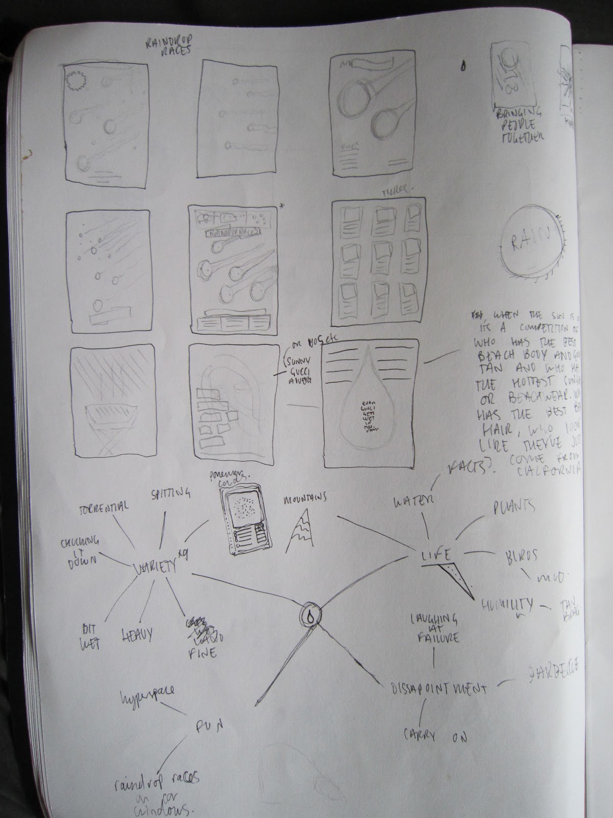
Thumbnail layout sketches

As it is quite a childish game I thought it would be good to personify the raindrops so I did some raindrop character sketches


I traced my drawings in Illustrator using the Pen Tool and limiting my self to 3 shades of blue.

I also knocked together a logo for 'Raindrop Races' which consisted of a raindrop and a chequered racing flag

I added some more water detail to fill the poster out and to give a better impression of what the game really looks like in real life.
Finished Poster

Poster No.2 Development
I started this poster by trying to replicate the 'Hyperspeed' effect used in Star Wars, as I have noticed this is similar to looking at the sky in heavy rain, which makes rain amazing and fun.
It is going to include the type:
'Looking up into the rain is the closest you can get to hyperspeed, without an x-wing'
I started by drawing a lot of lines and using the width adjustor tool to make them more dynamic.


I tried picking some fonts which would suit the poster.


My initial idea was to put the type in a circle at the centre of the 'hyperspeed' tunnel. This looked good on paper but when I started working digitally it looked a bit rubbish. So I went back to design sheets to develop the idea more thoroughly.

Thought it would be a good idea to include a simple image of an X-wing incase people were unsure as to what this was.

This allowed me to see which layouts would work best and how to arrange type without having to go through a lot of digital trial and error.
X-wing


More Type development:
I like text that runs in a circle, it takes a bit more commitment to read it which makes it more fun, similar to the jumbled up sentences that David Carson often uses.

Cheesy Star Wars vibes


When I was happy with the imagery and type it's just a case of making the poster look 'complete'. I can't bring myself to 'keep it simple', it needs more stuff going on!


Tuesday 21 February 2012
Poster Development
This poster is going to focus on the romance of rain

I started playing around with a crest/badge, as my tagline is "Bringing people together since 1852" which is when the first steel rimmed umberella was invented. So it's as if I'm selling rain as a product.

Playing with Free Distort

Repeat dashed lines for the rain

the Scribble stylize feature worked better for the rain. But the layout was looking weak and confused.

The rasin coming from the crest works better and more detail makes it look more complete.
D&AD is hidden in the girls mouth, the boys t shirt and the puddle on the floor!

I also tried adding a subtle 'screen print' esque texture to give it a more natural feel but I'm not sure it improves it much:

Subscribe to:
Posts (Atom)