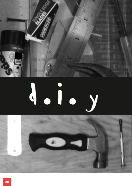
To really push the post modern theme I have created a brush typeface using ink and a stick to use on headers inside the publication. After a few failed attempts of inconsistent typefaces I managed to create an entire upper and lower case typeface with essential punctuation glyphs.
For the posters that will accompany the publication I wanted to use a really simple illustrative style as this is relevant to the D.I.Y subject and the pessimistic tone of voice. The posters emphasise the ruthlessness and cheek of some clients.
This poster describes the fact that clients don't like paying for a service and expect designers to live on exposure alone.
This illustrates clients searching for the best deals and under paying for services.
This illustrates clients thinking they know best and sticking their beaks in. In this case Old Mr.Mcdonald is trying to take some creative control over the famous golden arches.
Example Poster:
The poster will be printed on cheap paper and folded up inside the publication
Putting the font into Fontographer:
Complete font:
I also drew up a custom title to use for the cover and promotion of the publication which is a bit better than what I had before:
To illustrate the content of the publication I drew some relevant icons in the same style as the type and the posters:
The icons represent the themes of D.I.Y designs, clients using competition and speculative design, getting paid for design and avoiding any reference to original thought or ideas.
I want the publication to be wrapped in brown paper to mirror the themes of de-valuing your work and also reflect the pessimistic attitude of the publication
Repeating these icons fully over the wrap is visually effective and I think will work well with the inside layouts and aesthetic style of the book.
The title will be large on a belly band holding the whole publication together
Black on white
Or laser cut through
Example Spreads:
Original Spreads using generic brush font:
Using custom type:
I think that the pages look a lot more unique and dynamic using this new typeface rather than Ninja Naruto which is quite familiar and not really relevant to the content.
From here I will continue designing spreads and filling in the content. I may also create more posters that could be used for the promotion of the publication.
Potential out putters and endorsees of this publication would be any organisation that supports the rights of designers such as The Graphic Artists Guild, The Design Council and potentially awarding bodies such as D&AD and YCN but this is somewhat hypocritical as they are big criminals of speculative design, which the publication advises against, but at least they would actually give you exposure worth having.