Tuesday 21 May 2013

OUGD 505 Module Evaluation


What skills have you developed through this module and how effectively do you think you have applied them?


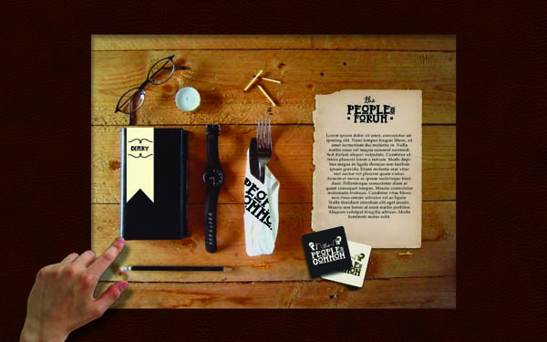
The most valuable thing that I have developed throughout this module is the ability to generate, analyse and refine concepts. The majority of 'The Peoples Common' was developing the concept and researching what it could evolve into. Participating in the concept development workshops was enjoyable and helpful and now I think that i understand what a concept is and how it can define and direct a project. In the future I will continue to ensure that I have a solid concept that is versatile and has the potential to be drawn across a range of products.

What approaches to/ methods of design production have you developed and how have they informed your design development process?


With this module and the COP publication I have experimented with using my own typefaces rather than relying on existing ones. Developing a typeface that suits the project that I am working on helped to guide the deliverables and define the aesthetic style that ran throughout the project. 

What strengths can you identify in your work and how have/will you capitalise on these?


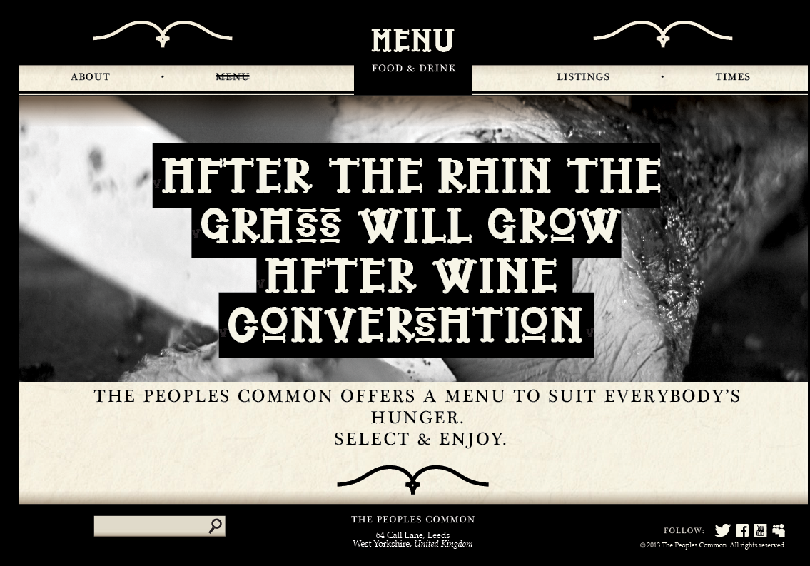
I am happy with the character that comes across in the Peoples Common I think that this was achieved by the custom typeface, simple illustrations and tone of voice. I will continue to push this personality in future work, where it is appropriate. I was also pleased with the mock up of the website, I think that it tied in well with the printed products, if I had more time on the project I would spend the time coding it to see how achievable it is as a concept.

What weaknesses can you identify in your work and how will you address these in the future?


This time I think that I could have made more printed products that would add to some good photographs of the brand as a whole. In the future I will spend the time to create a scene for photographing that communicates the feel and values of the establishment.

Identify five things that you will do differently next time and what do you expect to gain from doing these?


Push the photography and final presentation of the work to show the work in the best light as possible. I'd like to experiment with some motion graphics in the future where it is relevant. Making the time to code any websites I design is something else I'd like to do in the future to improve coding skills. When doing branding projects it would help to have a bank of high quality images to mock up logo's etc. on I will try to collect some useful images over the summer that could come in handy next year. Continue to experiment with typefaces, in the future I will design an entire set of glyphs so that the typeface has the potential to be used over more products.


5= excellent
4=very good
3=good
2=average
1=poor

Attendance:    5
Punctuality:    5
Motivation:      4
Commitment:   4
Quantity of work produced:    3
Quality of work produced:     4
Contribution to the group:     4

Monday 20 May 2013

Finished Products

Menu, Program, Invitation and receipts:


I photographed my products against a rich red to make the monotonous colour scheme pop out and also tie in with the regal, 'olde' style that runs throughout my publication.

Menu


This is the menu that contains all the information about food, beers and spirits


This menu is bound by using a saddle stitch


Invitation


Program

The poster/ program calendar is held inside the cover by a short piece of string


This is the reverse of the calendar:


A small poster that the customer can use as decoration in their room/ office


Posters

These banners are intended as promotion and way finding that would be situated around the 


Promotion


Staff uniform


Coasters


Signage to be situated around the building:

A sign like this will hang above the bar area


Signs like this will be used to show facilities and give directions:


Final Design Boards


WEB: Finished & Summary Post


I am happy with the outcome of the website, I think that the aesthetics tie in well with the printed products. If I were to take this project further then I would code this website and make it compatible with tablets and mobiles. Further development could include the introduction of an app in which users can connect to the forum and keep up to date with their discussions. Web promotion could also extend into video and interactive competitions.
To accompany the website there would be the Facebook and Twitter pages so that followers can receive news and updates as soon as possible.

Friday 17 May 2013

Peoples Common, Web Elements

Scamps for website and forum


I think using a 3 column structure throughout the website is relevant to the social and intellectual theme of the bar, referencing traditional books.


Touchscreen interface here


To separate the in-house touch screen experience from the web I thought it would be good to design in a relevant way to the surroundings.
As the touch screens are going to be set into wooden tables it would work well if the touch screen display was an extension of this. Various objects that are on the screen could link to the needed sources.

The screen will have an oak background and have a letter and pen that can be pressed to go to the forum, a set of cutlery for the menu, coaster for drinks, watch for opening times and a diary for listings.


I set up a scene on some wood to photograph from a birds eye view, I photoshopped in the parchment and coasters. This is how the touchscreen home page will look in the tables in the Peoples Common. Ideally this would have some movement such as a flickering candle, ticking watch, rolling pencil etc. it would also be ideal if the lighting on the screen altered with the lighting in the bar itself.


This is a brief idea of how the scene would look when on-screen, embedded in a table:


Homepage website


I wanted the Forum to be a bigger entity that just a page on the website. I created a sister-identity for 'the Peoples Forum'


I played with it looking like a book but it looked crap:


The landing page for the website will be split centrally for users to pick between the 


Making the texture as subtle as possible with hints of gradients around the edges works much better


Loading page


This will be the first contact that a user has with the site, a gif of the 6 key themes of the peoples common finishing on the stamp logo.


Landing page developed:
Adding some extra information and links to social media and a search bar helped to make the design more recognisable as a web page.


If the user selects 'The Peoples Common' this is the page that they land on:


All of the pages are relatively simple and the user just needs to scroll down to find out information

About page, scrolled down a bit:
The about page delivers basic information that explains The Peoples Common
When scrolled the page disappears under the tabs through the gradient. The top bar and bottom bar remain constant throughout the website


At the bottom of the page is a link to the forum


All links get a thick-thin strikethrough when hovered over. the page that you are currently on has a permanent strikethrough


All pages follow this general layout.

The events page has a second set of tabs to browse through different months, The content of this page should disappear under these tabs and not the master tabs.


The menu page is on large scrolling page that runs like the About page


The times page is the simplest just featuring opening hours:


Again, working from my rough scamps I designed the Forum in a similar way to the rest of the website


The homepage for the forum gives a quick overview of the most popular threads and comments across the board


This is a theme dedicated page where you can scroll through all the listings and get involved with the discussions. A more compact version of this will be available for iPhone and Android