Wednesday 27 February 2013

Digital Mock Ups

To gain a better idea of what design and colours will work best I mocked up 3 of Sam's designs on to the paper mock up I photographed in the photography induction:


1 design with 3 varied colourways:


Design 2 with 3 different colours:


Design 3 with varied colours:


Vacuum Forming

After returning to the laser cutter we re-did the moulds with more success than the first time... 

Today we finished the wooden moulds for our bottle stand and pill packet. Using the Vacuum forming machine we made plastic negatives of the mould:


The pill packet was successful as the plastic could be formed around each letterform and removed from the mould relatively easily


The bottle stand didn't work quite as well because it was impossible for the plastic to be sucked horizontally so the logo didn't come out as well as we'd hoped, apart from this the rest of the mould worked well:


Due to the shape of the mould it was very difficult to remove it from the plastic.


In the future we know what is possible to achieve with vacuum forming and will design around these restraints.


Threadless: Design a Monster

This brief was simply to design a monster for a t shirt. I noticed that a lot of the submissions were quite detailed and busy and didn't work particularly well for a t-shirt.

I decided to keep it a little bit simpler by limiting myself to just one colour and keeping the design balanced.


I added some Spanish to add mystery and myth to the design


The type reads: "The Horned Kitten, only those who do not fear are safe"


Re-Written Brief: L'artisan Parfumer

Tuesday 26 February 2013

Studio Workshop 26/02/13

We summarised key factors of our concept to understand how to focus our brief without filling in content with 'fluffy' and irrelevant content:


5 Words that sum up Small Talk


  • Awkward
  • Difficult
  • Skilled
  • Interesting
  • Artform
  • Networking


5 words that sum up target audience


  • Anti Social
  • Technology Obsessed
  • Awkward
  • Shy
  • 18-26
  • Friendly


5 Words that sum up the tone of voice


  • Lighthearted
  • Humorous
  • Lively
  • Friendly
  • Colourful
  • Informative


5 Products that you want/ could create


  • App/ Website
  • Interactive drinks menu
  • Elevator vinyl
  • Toilet signage
  • Poster/ flier
  • Bottles / glass vinyls


5 processes


  • Crafting - Interactive paper products
  • Crafting - Cutting vinyl
  • Improve HTML & CSS
  • Embossing
  • Screen Print


The definitive title of my project is:

An introduction to Small Talk, focussing on Branding and Identity with consideration for Information and Wayfinding.


Using these focussed words as reference, this is my written brief:

The Brief:

To create the branding and identity of a pub/bar that encourages its customers to engage in small talk and go on to create fluent conversation with complete strangers.

Background:

Small talk has become awkward and difficult for people in todays technology driven world, we are all to used to emailing and speaking online that the ability to comfortably converse with strangers has been completely lost. We want to change this by designing our bar in such a way that encourages our customer to speak to each other which will help them to make, potentially, important business contacts, interesting people and new friends.

Considerations:

The identity of the bar is not restricted to 2d printed paraphernalia, 3d sculptures, large vinyls and even ambient promotion can be used to bring in our clientele. The identity must be versatile enough to cover a range of products that create a strong and identifiable brand.

Target Audience:

The audience is going to be people looking for a new experience of a bar, generally between the ages of 18 and 25, more specifically they will be people looking to make contacts that could potentially get them work/ meet helpful people so this age would be closer to 22-25. The audience will be students but will be willing to pay a little more for drinks in a friendly and enjoyable environment.

Tone of Voice:

The tone of voice should be lighthearted and humorous to create a comfortable environment for relaxed conversation. It should be lively and friendly to set a good mood within the room. The use of illustration should be aesthetically pleasing as well as being informative.

Deliverables:

Branding and Identity for Small Talk based bar, this could include menu's, signage, promotional material, web design etc.


Friday 22 February 2013

Vacuum Forming


 To add support for the bottles when they are inside the boxes we are going to use the vacuum forming machine to create a plastic base which will grip the bottle as well as having the brand logo and additional information on.


After figuring out how to construct a mould which will be used to make the plastic base we talked to Liz in metalwork and Jewellery to find out if it wold actually work because we were aware of certain restrictions such as small details not working and that we might have to angle the walls of the mould so that it can be removed from the plastic.
The best solution to making the mould is going to be to laser cut the bulk of it and then sand a 3º angle on each wall of the mould.

After measuring the radius of our medicine bottles I have prepared the files to be used for laser cutting, I have added small pads at each 90º of the circle that are designed to decompress and grip the bottle tighter than if it were just a straight face.


As we are basing the perfume on medical products we are going to create some blister packs for swallowable perfume tablets (see design context) as a design proposal as this is a modern invention and would help the brand stand out against competitors.

This will be vacuum formed with clear plastic so that the colours of the tablets will show through


We had some problems laser cutting at first with getting the right depth and also the computer was playing up a bit and not sending the files to cut, eventually we got about 30% of the things we needed.


The mould for the base, however, was too small, despite measuring it accurately


We will book another slot and try this again.

Thursday 21 February 2013

Packaging Design - Mock Ups


Mock up #1

The first net that I have tested was this one:


It features a rectangular viewing panel that can be covered with clear plastic or acetate so that the contents can be seen, we can utilise this so that our brand shows through or keep the packaging design constant and change the information that shows through the panel.


This box would contain a 50ml medicine bottle in which the perfume will be stored.
This box also has an easy opening which is very common in medical packaging to make quick access possible


These are some photographs that I took during the photography induction, these were taken inside a light box which works very well for photographing 3d objects and is what we should use when we are documenting our final products.


Mock up #2

As part of our perfume packaging range we are considering how smaller quantities could be packaged as it is common practice to sell a variety of volumes of fragrances.
As we are pushing the medical aesthetic we thought that the perfume could be applied using a pipette or a needle less syringe.
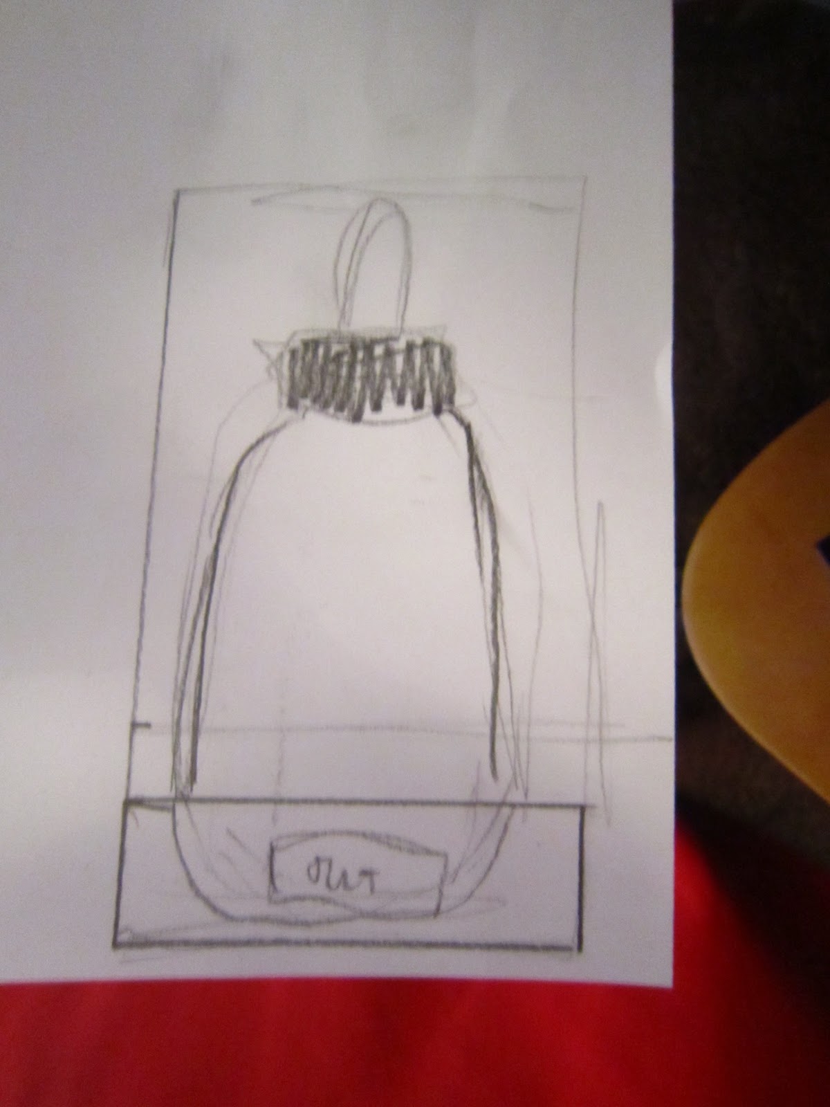
This net features support for a thin bottle neck, we could adapt this so that it holds a pipette firmly which will be much more professional and nicer to engage with than just having a pipette floating around in a box.


Neck support:


If made out of thicker stock then this structure would be very solid


The closing at the bottom is glue less which makes construction much neater and flush.


We are going to get inducted on the blow moulding machine so that we can make supports that will hold the bottles firmly when they are sitting within the boxes.


I assembled this packaging that could be used to store the syringe perfume sample:


This net was successful, it holds together tightly without any glue and the viewing window can be moved to suit our range of products.


This net would be suitable for two tablet packets and an information leaflet in the middle


The net didn't seem to fit together very well, with tabs that seemed to not do anything


I thought that this net would suit housing all of our perfume range in if the net were to be edited so that it would contain four bottles. 


The picture in the book is very deceiving as the proportions and flush edges don't exist.
I couldn't figure out what these additional holes were meant for: 


This insert which is supposed to make the separating walls seemed to be too big for the rest of the net.


I will stop using this book as it doesn't seem to be very helpful with any nets that need multiple parts.