
Scamps for website and forum


I think using a 3 column structure throughout the website is relevant to the social and intellectual theme of the bar, referencing traditional books.


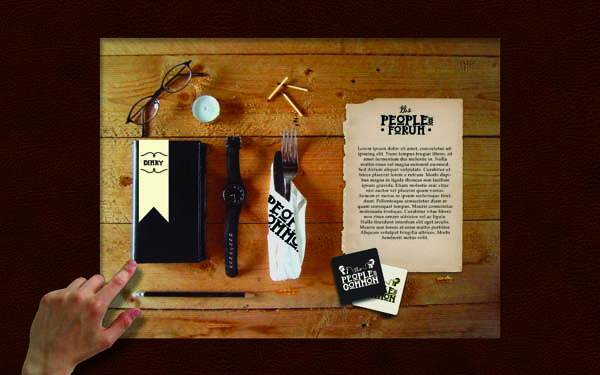
Touchscreen interface here

To separate the in-house touch screen experience from the web I thought it would be good to design in a relevant way to the surroundings.
As the touch screens are going to be set into wooden tables it would work well if the touch screen display was an extension of this. Various objects that are on the screen could link to the needed sources.The screen will have an oak background and have a letter and pen that can be pressed to go to the forum, a set of cutlery for the menu, coaster for drinks, watch for opening times and a diary for listings.


I set up a scene on some wood to photograph from a birds eye view, I photoshopped in the parchment and coasters. This is how the touchscreen home page will look in the tables in the Peoples Common. Ideally this would have some movement such as a flickering candle, ticking watch, rolling pencil etc. it would also be ideal if the lighting on the screen altered with the lighting in the bar itself.

This is a brief idea of how the scene would look when on-screen, embedded in a table:
No comments:
Post a Comment