
Bottle Label Design Sheets:
Now we have sorted out the perfume box and leaflet we needed a label that would be nice enough for the customer to want to keep without the additional packaging.
The initial, and most obvious idea was to simply use a white label in the style on the rest of the identity

This seemed to be quite underwhelming and we want to deliver more of a surprise when the package is opened

We thought that using an elastic band would give the user more of an interactive and tactile experience
I tried mocking up some of the ideas on a bottle to see what visual impact they
had:

This is the finished base (mock up) for the bottle that I have designed after vacuum forming didn't go as planned

It is in two separate parts, that fit comfortably inside each other. When this is made out of higher quality stock and neatly glued it will look attractive and also offer support for the bottle.
This base will be embossed with the logo on one side that will face outwards from the packaging.
This base will be embossed with the logo on one side that will face outwards from the packaging.


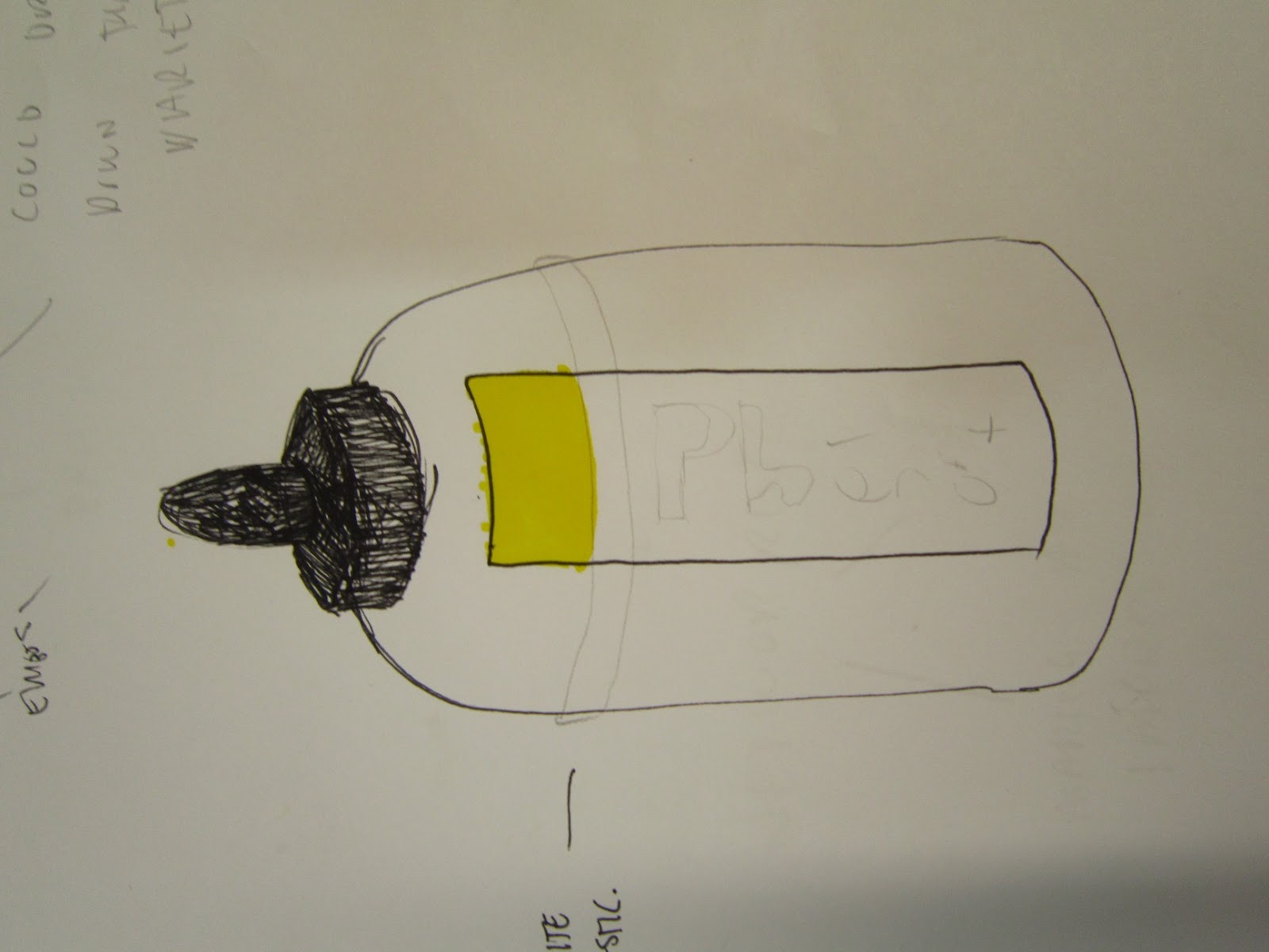
We could look into cutting through the label to reveal the individual fragrance colour, however I think that this would look unprofessional and 'tatty' regardless of how hard we try to mock it up.


Using quick vector illustrations was very helpful in quickly

We both agreed that making the bottle quite dark and using a lot of black would help it really stand out from the vastly white packaging and stock


This is the design that we are going to go with, the black stock will be embossed with the 'Phero' logo and the Perfume will be identified by a sticker that also holds the label together

Example of emboss:

We will still feature the white elastic band as this adds another interactive element and can also be utilised for practical purposes such as keeping a cotton pad with the bottle for application. it could also be used to hold information leaflets etc.


No comments:
Post a Comment