
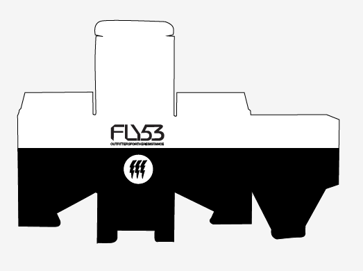
I chose this box to work from

When deconstructed the net of the box is like this:

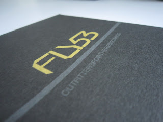
The branding that I chose to combine the packaging with was taken from this clothing label:

These are the 20 variations of 'Fly53' branding that I came up with for the net I chose:


From these designs I chose what I thought worked the best and then tried applying them to 4 other nets which I will later print and assemble.
These are the nets of my packaging


These are the vector traces of the nets:

I tried out a couple of designs that I thought were the most successful


I tried adding in some colours that Fly 53 have previously used:

I then applied this design to the 5 nets referring to the original nets to see where the branding would end up and which way it had to be:

After looking at these designs for a while I think that the white looks a bit offensive and a more 'stealthy' colour would work better:


Printed and assembled products:


Feedback


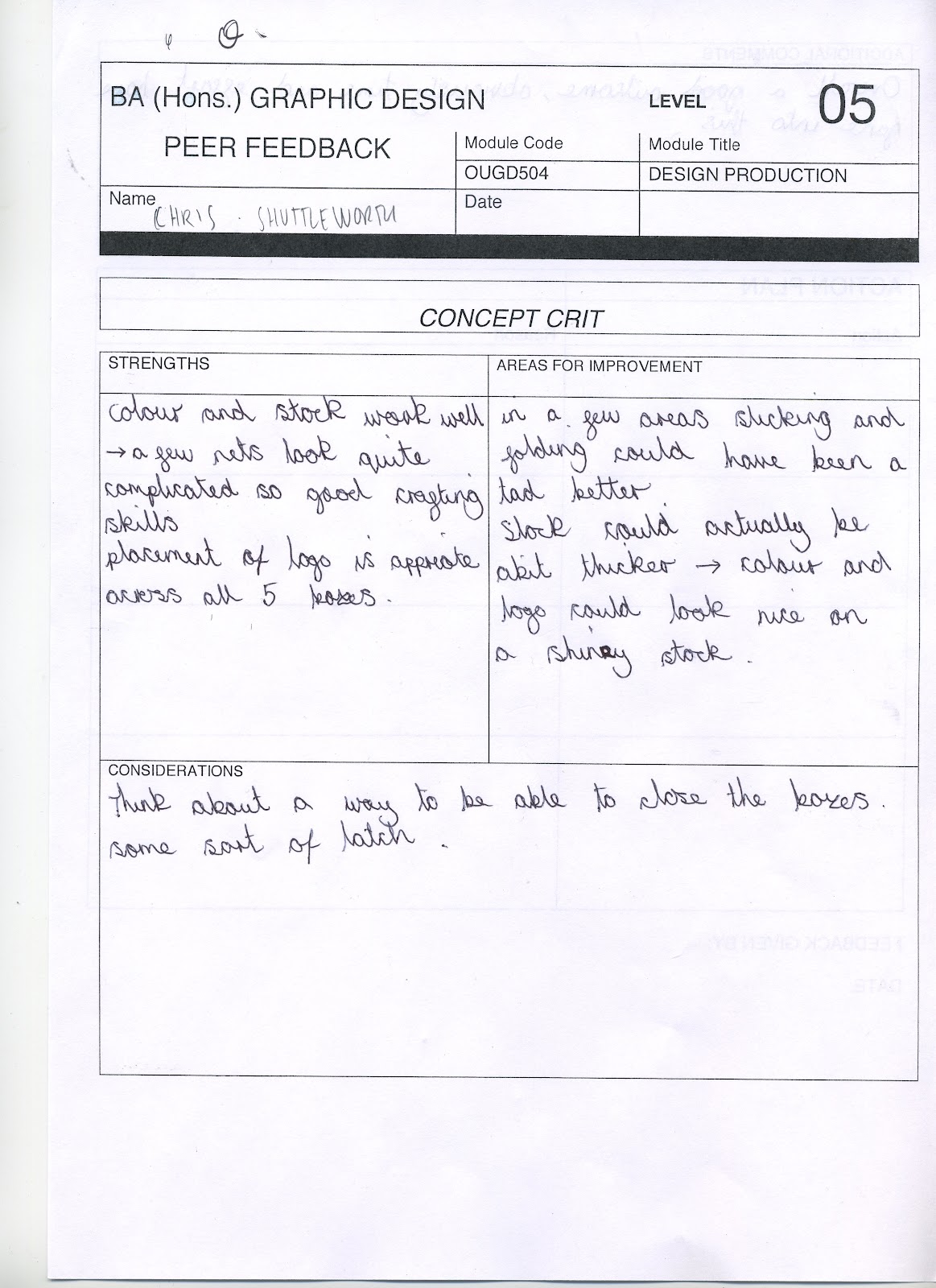

The definitive points of feedback that we got as a group were:
- Stock quality- it's better to print onto good stock rather than poor stock and trying to make photos of the product look good.
- Craftsmanship- shoddy cutting, should use laser cutter or sharp scalpel
- Range of nets- Good application of design over different styles of net
- Colours and use of design- could have used colour more effectively- make sure that printing onto different stock doesn't affect the colours.
- Context- are you using a net that is instantly associated with a product? Some nets are stuck to a brand even if the branding is removed (e.g. coca cola bottle, Toblerone, Duracell battery pack)
No comments:
Post a Comment