
Colour Modes
RGB appears a lot brighter and more vibrant than what the actual printed piece will look like, the first part of this tutorial looks at ways of seeing on screen a more accurate representation of what the printout will look like.


Using the Gamut warning you can make adjustments so that what is on screen is what will be printed by altering saturation etc...


Using Proof Colours (Cmd+Y) changes the document to CMYK so you can tell how the printed version will look

To start off with an empty swatch palette, to save having to delete each one one by one, you can go to the menu and 'replace swatches' and find a previously saved palette with only one black swatch

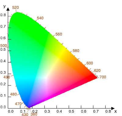
Lab Colour Mode
That little box indicates that this is a web safe colour, meaning that it will be accurately reproducible on the web

- Always convert image to CMYK in photoshop before taking into inDesign
Image>Mode>Duotone

As well as choosing what colour inks you want to use you can use the curves button to alter how much colour is applied to the different parts of the original greyscale, the x axis represents the tone of the original greyscale and the y axis represents the amount of colour that will be added to that area.

example:
Lots of colour in the dark parts of the original

Lots of colour in the light part of the original greyscale

Channels
The channels panel allows you to switch off one of the colours that are in the selected colour mode.


You can use selection tools to apply spot colours to specific parts of the picture

No comments:
Post a Comment