
The brief requires a large poster for local advertising.
I have decided to keep it simple and contemporary to grab the attention of the design-based audience.
The focus of the poster must be on typography and be contemporary and eye catching


I have decided to elaborate on this basic idea, which just outlines a simple layout that is similar to the design of the current leaflets and web design:

I have used a halftone image that is right aligned to keep it consistent with the printed publication and the website.


I am going to screen print this poster so that I can achieve the bright colour that will be unachievable through digital print:

Screen Printed Posters:
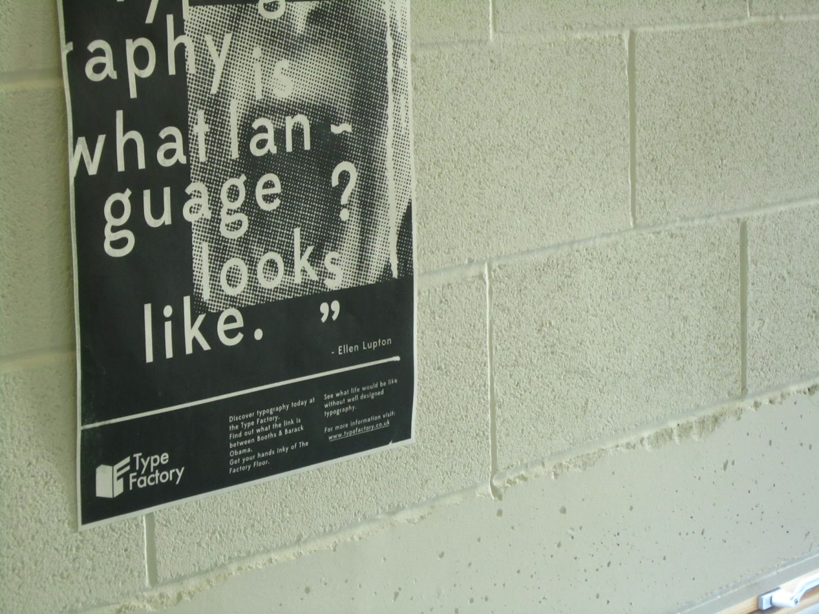
This is the first batch of posters I've screen printed, some of the light sensitive emulsion dripped when it was drying which has caused the line down the right hand side of the poster, I have tried filling this in with screen filler to see what effect that has on the end result, after trying some gradients out I think a solid colour will be more effective, I will try this on Monday and post the results.


This is the result of filling in the gap down the right hand side:
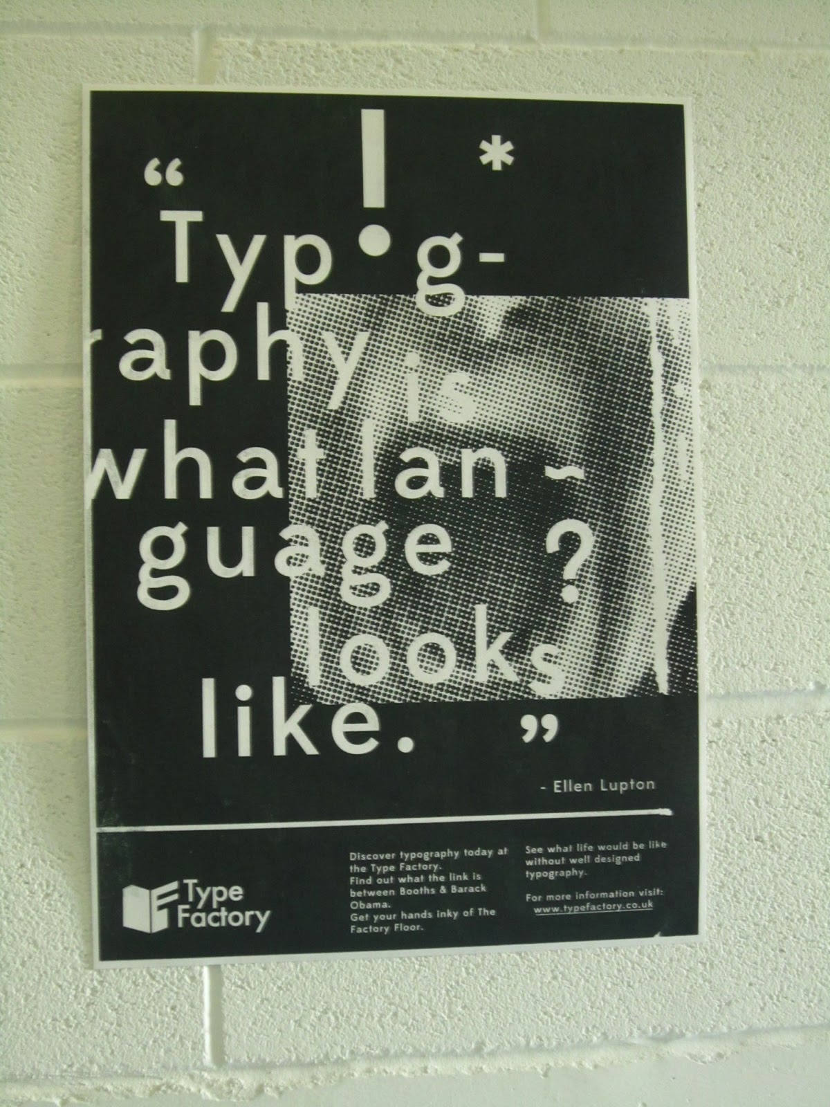
Using solid black definitely improves legibility and puts the emphasis on the typography but the bright green poster will stand out from its surroundings and intrigue the audience to look closer.

No comments:
Post a Comment