My initial idea for the label was that I would draw some icons that relate to various aspects of the creative industry and leave a blank space at the bottom of the label. This would allow two creatives that have just met to write down notes about the person they have met and contact details for future reference:
After a while playing with this idea I decided that nobody wants to be faffing about writing on bottles when they're just chatting and having a drink so I decided to just create something that looks good and would appeal to the creative eye, using some images I think work well aesthetically I set out creating an illustration that embodies what Creative Networks is about:
The main thing that will link all creatives will be the pencil, wether it's for sketching ideas or illustrating designs the pencil is used by everybody, around this I have included related imagery: Key and lock to represent networking opening doors, needle= fashion design, brush= fine art, book= graphics/ media, camera = photography etc.
more detail:
The accompanying coasters feature the current colours used by Creative Networks and follow the same style as the label, URL's for Creative Networks social media is on the reverse, these act as souvenirs or reference for the user.
Changes as requested by the client:
Incorporating the Creative Neworks colours
Adding the word 'Hellfire' into the label:
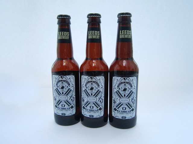
Here are the finished and printed Hellfire Bottle Labels:


No comments:
Post a Comment