


Here I am experimenting with the bottom layer of my mail shot showing through the cut out letters of the top sheet, I think that green showing through brown works a lot better than brown showing through green which is a bit difficult to look at.


This is seeing what it would look like if the information was on the bottom layer and it showed through instrument cutouts on the top layer. I don't like the way this looks, it looks really weak and cheap and a bit scooby doo and isn't very engaging at all.

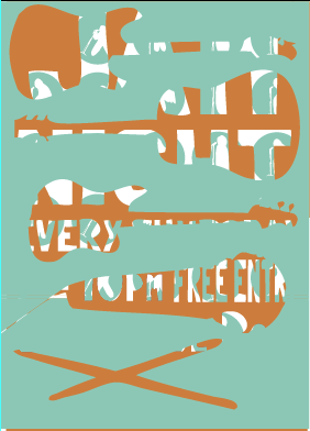
I quite like how intriguing this looks, because at first it is confusing but then as you go down the layers it is revealed, however in reality I the layers would scatter as you took them out of the envelope and the top layer would be unnecessary.


This is what the 3 layer idea would look like if it obeyed the 2 colour rule, it doesn't work as well as it did with the black layer. I think that this idea is playing with the cut out gimmick too much and the top layer having instruments cut out and the second layer having all the information cut out is unnecessary for the purpose of this mail shot.
No comments:
Post a Comment