Monday, 1 October 2012

3x Promo Material for World Toilet Day

For one of these products I thought that a door hanger would work well as this could be placed in the environment that it is promoting, I wanted all these designs to be relatively short on information and more to lead the audience online to the world toilet day's website and social network sites.


Development of Hanger


Creative Interpretation of a Flier


For the 'creative interpretation of a flier' product I wanted to make a small self assembly paper toilet that the user could assemble and have on their desk to prompt questions about world toilet day or to assemble and give to a friend to spread the word.
I began by sketching out some nets that I thought might work and making a lot of mock ups:


I then started filling in the net with what I thought would work...


But after printing and trying it out it wasn't how I imagined it at all and it was hardly recognisable as a toilet!


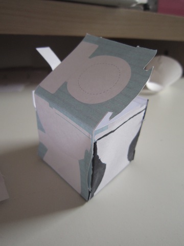
I tried a new design where I got rid of all the blue so it would look more like a small toilet

 This design looked better than the first one did on screen but after I printed it and tried assembling it I would see that it wasn't working either. This simple box shape didn't suit the complicated gradients.


I experimented with some nets that would bend but this ended up becoming complicated and would be too complex a net for me to make or for anybody to assemble easily.


I liked this part of one of the mock ups, which is the flush closet that sits on top of the toilet so from this I decided to keep it simple and make it into a little square toilet with simple shades,


something similar to this:

Despite my printer running low on ink I could see that this direction could work pretty well if it was printed better on thicker stock and the two parts were the same size


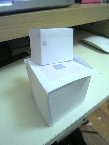
I combined the 2 simple nets to make this all in one toilet net with only 4 flaps that need inserting


I then designed a flier around this net to give people an idea of the cause and the purpose of the toilet:


Non A-Format poster


I initially thought that designing a sheet of paper that could be used to wrap some toilet paper up in would be a good idea which people could use and then they'd be left with a crumply poster which in some ways references the toilet paper.
I had some imagery from the summer brief products that I could use to make a pattern aswell:


I tried wrapping a toilet roll up in a square of paper


I found the stock difficult to fold but twisting the ends a bit like a christmas cracker worked well.

This is the design I came up with:


Finished Products


Sunday, 30 September 2012

Packaging & Branding task 27/09/2012


 Duracell 4x AA battery packaging


This Duracell battery packaging has quite a complicated net design.


Strepsils box and blister pack


Face Bank (Coin bank) box 


Kleenex plastic film tissue packet


FCUK deodorant spray can


Branding & Identity


Tuesday, 15 May 2012

406 Self- Evaluation

What skills have you developed through this module and how effectively do you think you have applied them?

There have been a lot of new challenges in this module that forced me to try new approaches and techniques. I have worked more on my idea generation techniques throughout this module, completing more design sheets and developing multiple ideas before settling on one which has worked well in helping me to identify the best solution. My software skills have been improving through this module as well which allows me to spend more time on the idea and hand drawn development of the brief and not struggling to translate from paper to digital.

What approaches to/ methods of design production have you developed and how have they informed your design development process?

The most valuable approach to design, I find, is thorough design sheets. Pushing on and forcing myself to think of more ideas even if there is one that is standing out allows me to fully explore what the best and most feasible solution will be. Doing surveys and gathering primary research has contributed a lot to the final outcome of my work, especially in the 'Tins of Things' brief, getting results from a survey let us know what the audience would respond to and engage with. From the start of this module I have also been looking at more existing work than I have done before and putting the work I like on a separate blog, this has been very helpful for inspiration and seeing what options are available before going down a similar route to a previous brief. Group pitches and crits have also been very useful, getting a second opinion and some fresh input has informed a lot of the final products that I have been designing in this module.

What strengths can you identify in your work and how have/will you capitalise on these?

Throughout this module I have been pleased with how much more professional my work is looking in comparison to the start of the year. I think this is mainly due to becoming more familiar with software so this is something that I need to keep playing with until I know it very well. 
I was happy with the final outcomes for 'Tins of things' and 'Stamp it' because they looked well executed which is something that usually drags my work down- the final outcome not being produced to a high enough standard. I would have liked to have done this with the 'Your Choice' brief but couldn't access print or afford a one-off copy of a book, however I found that displaying it on my blog in an e-book form looked how I wanted it to, this will be something I will use more in the future.

What weaknesses can you identify in your work and how will you address these in the future?

After having designed the rain posters and having crits I realised that I hadn't properly considered the audience and had designed something I liked but not necessarily what the audience would. In the future I will conduct more research into the audience I am designing for so I can better understand what visual style and tone of voice would appeal to them.
I have also noticed that my work sticks to a relatively similar style which is something I need to try and move away from. In future briefs I will try and leave my comfort zone entirely and work in a style that is relevant to the purpose of the design.

Identify five things that you will do differently next time and what do you expect to gain from doing these?

  • Spend more time researching audience, this will allow me to design a more informed and appropriate solution to the problem.
  • Explore new formats that are more engaging and attention grabbing, which will force me to design within new restrictions and think differently.
  • Spend more money and time on final outcomes- testing stock and format before printing final products will make a more successful design.
  • Do neater design sheets- I'm finding design sheets very helpful but at the moment they are a bit of a mess to anyone else looking at them, it will be more useful for progress crits if they were laid out neatly and annotated. This will give me better feedback in crits.
  • I also want to try designing in a different style than what I am used to, which will broaden my skill and understanding of a wider range of design.


5= excellent
4=very good
3=good
2=average
1=poor

Attendance:    5
Punctuality:    5
Motivation:      5
Commitment:   5
Quantity of work produced:    4
Quality of work produced:     4
Contribution to the group:     4


Monday, 7 May 2012

Your Choice- Presentation Boards


Your Choice- Issuu


Open publication - Free publishing - More fun book


This is the first time I have used Issuu to display my work. It's very useful as an evaluation tool so you can see how the outcome will look before printing. After reviewing my publication this way I think that there are some more details that could be added to the page to make it look like a more professional publication. I will see what feedback I get from the crit on Tuesday and act on it then.

I will definitely use this tool in the future when designing any sort of publication before sending it to print.


A5 books:
Photobucket

Photobucket

Photobucket

Sunday, 6 May 2012

Box Illustration- your choice


I have rendered my product using illustrator for the final crit as there is no space for printing and I don't have the money or resources to make the product as well as it would be if it were a legitimate product.
The aim of these mock ups is to make it clear to the viewer what the product is I have designed and how each part works as a set.