Saturday, 30 March 2013

CoP Development and re-written Brief

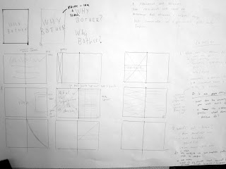
My publication is going to explore what the significance of a designer is in today's world and why should a client work with a designer rather than using online templates/ tutorials etc.

There are two audiences that I could focus this publication on, I could either aim at the client and inform them what it is that a designer brings to the table or I could aim it at the designer and remind them what they need to be doing to be unique and inimitable.   


After mind mapping the amount of content I would be able to make relevant for each audience I decided to focus the attention of the publication on the designer as this allows me to focus on the ideas and disciplines of Modernism Vs Post Modernism as well as making them aware of what other options clients can choose rather than using a freelance designer.


After jotting down some ideas I have decided to stick with a pessimistic, post modern, "What's the point of even trying?" tone of voice that seems to be communicating that there is no reason for a designer because there is so many free facilities for design available online, but the main point of the publication will express what important influence the designer needs on a project and that understanding what and who you are designing for is the key to success. 


This is the focussed brief that covers the content and direction of my publication:


Monday, 25 March 2013

Finished Products and Extended Submission

These are a few pictures taken from our photo shoot of all our final products:

This is the complete range of physical products


This is the interior of each box with embossed base and leaflet:


In addition to the physical submissions we are proposing how the range could be extended and promoted, I mocked up a potential web element and Sam mocked up how the range will be promoted through magazine adverts and public advertising.


I used the existing Lartisan Parfumeur website to mock up the concept


The idea is that the user can pick a colour they like and then a scent will be matched to that colour to best suit that customer, this allows users to feel more part of the overall experience and the fragrances will feel more personal to them:


This is the summary that we submitted to explain our project:


Sunday, 24 March 2013

Extended Vovomo range

Vovomo is a company that specialise in designing and engineering cases for smart phones.

I designed their identity, web presence and staff uniform that has a bit more of a personal touch than the average obligatory clothing.

I extended this project from a Design crowd brief to give it more weight, the products that make up the range are:

Letterhead, receipt, business card, lanyard, employee t-shirts and web banners/ adverts.


Using Bevel/Emboss effects on Photoshop I have mocked up the logo to show how it would look if imprinted on an actual case


I managed to make use of Sam Hoh's smashed iPhone to show the advantages of using a high quality protective case


The logo is used to construct the shape and imagery of the business card which is kept simple and strong.


These are the t-shirts that will be worn by the employees working in store they are designed to be un-daunting but strong so that staff appear approachable but also knowledgable, using brief and too the point sentences gives the impression they know what they're on about.


This is the Facebook page where Vovomo can post updates and offers to extend their customer reach and target specific markets.

If I were to extend this brief further this would change to a custom website and shop.


Thursday, 21 March 2013

Concertina 3: Swapping Around

After having a few other people contributing to what was done as the concertina book.

Some new things that were added were solid blocks of type:


using text wrap to change how the text fits on a page


Using typefaces that I would have never considered.


4d Interaction - Small Talk Pub

Touch Screens

To interact with the invited interviewees who will be connected online with the Peoples Common the tables will feature touch screens on which each table can communicate with each other in an IM set up, and also submit questions to the forum where the best ones will be voted for and submitted to the person in question.

These screens can also display food and drink prices and have interactive menus etc.


At the moment touch screen tables have only been introduced into a select few restaurants and not seen a lot in bars.


In the peoples common I would want the touch screens built into old oak tables to represent the aspect of online communication being put in a more traditional environment.


This interactive element could also go on to include smart phone apps, tablet apps etc that allow people to interact with the forum whilst they are mobile.


Wednesday, 20 March 2013

What is Good? Re-Written Brief


Open publication - Free publishing


Here is the definitive brief of the direction my project is going after receiving feedback from the research part of the project. After concept crits is was said that the idea of bringing the social internet environment of forums etc. into a real life setting is a good idea. And also if there was a common attraction that was appealing to like minded people so that you know if you are going to a night, even if you were on your own there would be somebody with something in common before you even got there, this would be better than talking to complete strangers. This informed the AMA idea of being able to converse with the people around you and decide what a good question to ask would be, you can then discuss the answers and connect with new people about a common topic.

Monday, 18 March 2013

Cop Concept Crit

Title of Publication: What makes Design Inimitable?

I intend to communicate the relationship between:


  • Decoration/ Communication
  • Client / Designer
  • Original Content / trends
  • Quality/ Quantity
  • Trend & time
I intend to inform a group of Designers/ clients that fashion/ trends/ unoriginality does not constitute good design.

In order to achieve this I will produce a series of publications that make specific points from different perspectives.

The main area that I need to iron out in this proposition is the audience, I could target it at design students- reminding them that originality and independence is more important than following trends, or I could aim it toward clients, proving to them that the job of a designer is much deeper than surface aesthetics that you can get for free from Moo.com, Vista Print, Word, etc.

I think that aiming it at clients will be more interesting and relevant as choosing design students is a bit of a cop off and simple ask because it is essentially designing for myself.


Concept Boards- CoP

Friday, 15 March 2013

Small Talk Research Book


Open publication - Free publishing


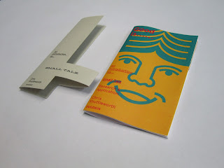
This is the printed version of the publication, it is simply staple bound as this is as relevant as any form of binding to the content of the publication.


The belly band covers the mouth of the front cover illustration to illustrate the purpose of the project when the reader removes the band


Representing comfortable socialising and no socially awkward tendencies:


These pages outline the general aesthetic of the venue that must appeal to a pleasant audience that have expendable income.


This sums up the overall intentions of the project. it is to create an environment that has the potential to make people feel comfortable with talking to each other, this will open up opportunities for peoples social and professional lives.


Thursday, 14 March 2013

Tuesday, 12 March 2013

Colour Matching & Crafting

Here are the finished leaflets that go in the boxes:


The leaflet gives information on how to use the product a brief description of what the perfume represents and health and safety warnings. This information is translated into 5 other languages to that are the most common in places where L'Artisan Parfumeur sell perfume


We had some trouble with colour syncing. I printed the stickers (Small yellow rectangle) in Digital Print and the leaflet is printed from a laser jet and you can see that the colours are quite drastically different


It was most apparent on the yellow. I tried to remedy this as best I could by changing the colour on the document to compensate for the printer, this worked relatively well and was an improvement on the original difference but still not spot on. If we were to carry this design proposal through to industry we would specify Pantone codes so that all the colours were clear and consistent.


We also had a lot of trouble with the blue, these 3 shades are from 3 different printers all using exactly the same file. We are going to leave this slight difference for now and photoshop our images if the difference in tone is obvious and distracting

We finished constructing our nets today, we used a strong laminated stock that is very similar to the packaging that is used for most medical products, it was very easy to score and fold and produced a strong and structurally sound package.