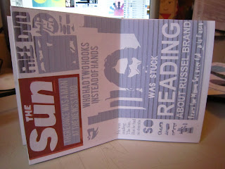
I liked how the pictures of the door, newspaper rack and ladders looked as though they had a story behind them, like they'd seen a thing or two in their time. I decided to take this idea and write a little story for each of the pictures, I went for limericks because they are pretty simple and funny.
Door:
There once was a dark wooden door
who's toes touched a carpeted floor
if you went in
you'd be soaked to the skin
cos' his head has a bucket ready to pour.
News stand:
There once was a man at the news stand
who had to hooks instead of hands
he was reading The Sun
But he had no thumbs
so was stuck reading about Russell Brand
(because russell is on the front page and he cant turn it coz e's got hooks, might need some explaining that one)
Ladders:
There once was a man on the ladders
who had no lungs but had four bladders
he was looking for air
you can drink in times square
but died when he drank from the gutters
haha, that one is scraping the barrel a bit, never mind.
mock up
This was the initial design I came up with, which is allright but, a bit boring and well in my comfort zone, I decided to experiment a bit and try something I'm not as comfortable with.
mock up
I tried this, kind of, minimalist feel where the text copies the shape on the right and the poster consisted of a big block of text that linked the posters together, saying that 'bad things are good in comparison to worse things'. Water on head < Hooks for hands < No Lungs. I think this sort of thing would look quite good if someone else did it, I don't like how dead it looks, its too empty and 'half done'.
I tried adding bits of decoration and changing it a bit. some bits still look irrelevant and cack.
So I tried to find a middle ground between, clean, tasteful design and fun, attractive illustration:
Adding more variety made it much more appealing and interesting. I also managed to find a way to visually communicate the 3 levels of Fun/ sort of hassle/ Hassle:
The bucket on the door is on a bright optimistic background.
The man with no hands is on 'The Sun' which is sort of in between happiness and sadness.
The man with no lungs is on a black sky with star signs illustrating his demise.
I think the aesthetics of this design will work well when printed onto some nice stock.
mock up: Ignore the bad printing
POSTER
I initially started by doing something that i was familiar with that suited the first ilustrator-ey book,
then I decided to be less samey and try some new things..
I tried working with the big block of text where I was rambling on about optimism. But aesthetically it looked a bit rubbish, I tried to make it more appealing by adding patterns but this didn't work wonders either.
I decided that one solid sentence that sums it up would work better for a poster than a huge block of text.
I've settled on this design which has the sentence 'be annoyed that you're wet or be glad you're not dry' which is supposed to communicate that it's all about perspective and the way you look at things that defines if they are bad or good.


No comments:
Post a Comment